

Boutique Store Front Design for Jenks Store Owners
You're standing on Main Street in Jenks, watching a family head back toward the Oklahoma Aquarium. They glance at your window, slow down, and keep walking. The display is attractive, but it hasn't answered the question that matters: why should they walk through your door today?
A successful boutique store front in The Ten District does more than look polished. It helps a passerby understand what you sell, where to enter, whether the shop fits the outing, and what to expect once inside. That matters across the district's ten-block stretch from the Arkansas River to the historic Midland Valley railroad tracks, where foot traffic changes with parking, festivals, riverfront activity, and the rhythm of Main Street.
Table of Contents
What a Jenks Storefront Has to Do Before It Looks Good - Start with the decision outside
Reading Jenks' Downtown Core Rules Before You Touch a Window - Build within the storefront bones - Let historic proportions do useful work
Designing the Window as a Measurable Entry Funnel - Run a clean Main Street test - Remove the noise
Signage, Lighting, and Materials That Match the Block - Choose materials with a local vocabulary
Accessibility as a Storefront Conversion Strategy - Use a sidewalk-to-checkout test - Inspect after every setup
Connecting the Storefront to Google, Hours, and the Drive from Brooklyn - Put the minimum information on both sides
Seasonal Refreshes, Permits, and Parking on the Ground - Plan around parking that may change
What a Jenks Storefront Has to Do Before It Looks Good
A Saturday storefront has a short window of opportunity. Families may be walking from Jenks Commons Park, heading toward the Arkansas River, returning from the aquarium, or moving between restaurants and independent shops. They aren't studying the facade. They're making a quick decision while managing children, bags, weather, and the next stop.
That's why storefront design is a business decision before it's a decorating decision. A pretty display that hides the category, blocks the entrance, or says nothing about the shopping experience is working against the store.
The historical role of the storefront supports this practical view. Main Street shops evolved as both commercial and social spaces, using glass, signage, and open fronts to put merchandise and activity in front of pedestrians. The history of Main Street storefront design shows why the facade has always functioned as a public-facing marketing surface, not just a door in a wall.

Start with the decision outside
Before choosing mannequins or paint, stand across the street and write down what a stranger can understand in five seconds:
Store identity: Can someone read the shop name from the dominant walking approach?
Category: Is it clear whether you sell clothing, gifts, home goods, or another specialty?
Entry: Does the door look obvious and easy to use?
Reason to stop: Is there one product, story, or offer worth a closer look?
Next step: Can a visitor tell whether the store is open?
Owners can also use brand identity development for a Jenks storefront to make the sign, window, materials, and interior promise feel like one local business rather than disconnected design choices.
Practical rule: If a visitor has to decode the window, the display is too complicated.
Our downtown has a useful advantage. Independent shops create reasons to keep walking, comparing, and returning. Cedar & Lily, Motley Market, and Lenny Lane give the district a concrete shopping identity, while nearby dining and riverfront destinations extend the outing. Your boutique store front should make that multi-stop trip easier, not ask visitors to interrupt it with guesswork.
Reading Jenks' Downtown Core Rules Before You Touch a Window
Pinterest can give you ideas. It can't tell you whether those ideas fit Jenks' Downtown Core standards. Owners should understand the local framework before ordering signs, rebuilding an entrance, or committing to a display-window layout.
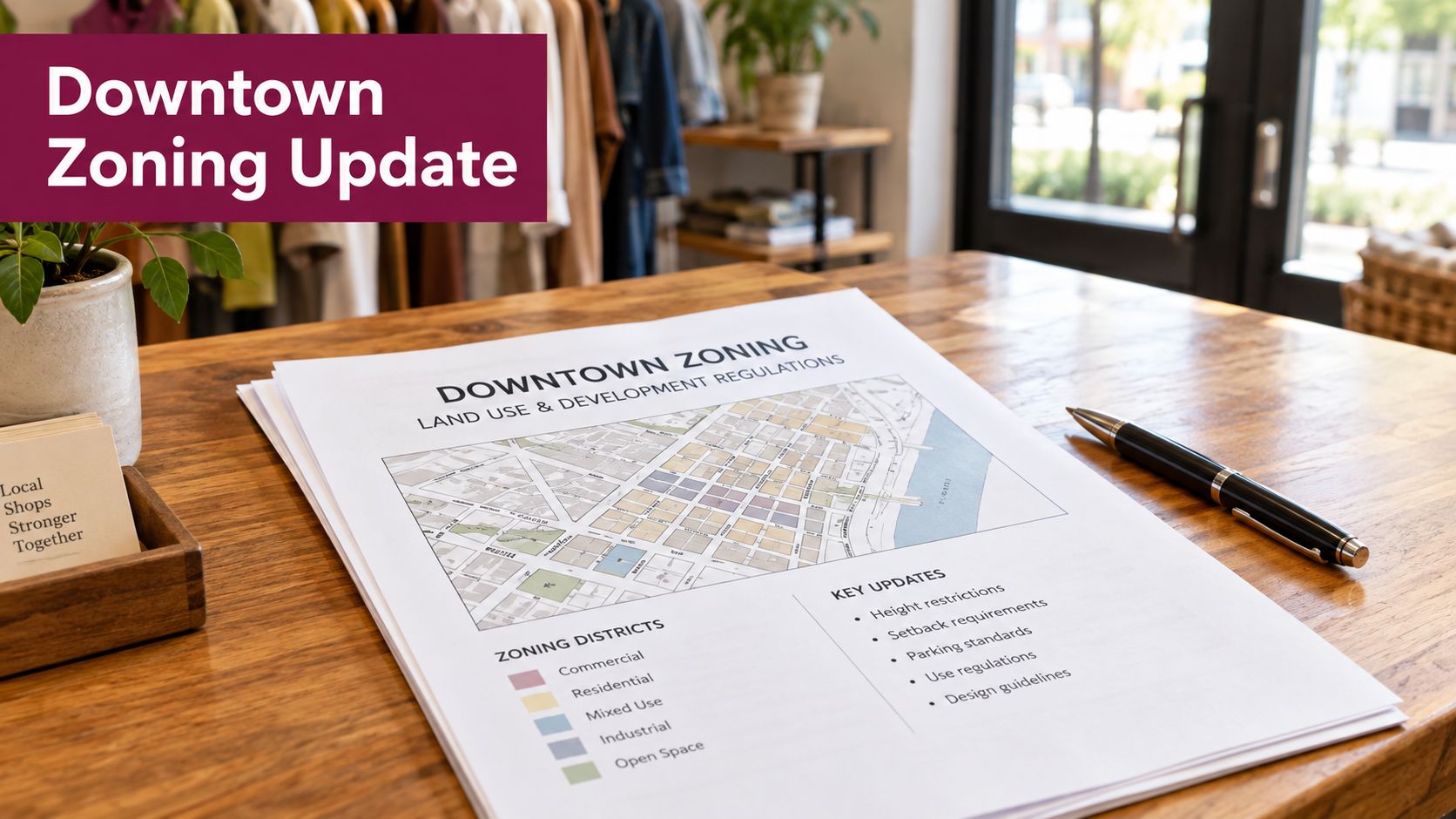
The Downtown Core is intended for mixed-use, pedestrian-oriented development, with commercial uses such as retail generally placed on the ground floor. The primary building facade must adjoin the required minimum front setback, and the main entrance must face the primary street. Those rules reinforce the basic Main Street pattern: shops meet the sidewalk, and customers approach from the public street rather than from a hidden side elevation. The Jenks Downtown Core zoning code is the place to confirm the requirements that apply to a particular property.
Build within the storefront bones
Jenks' standards also encourage awnings or canopies across most of the building frontage, along with operable windows and doors that make the shop feel connected to the sidewalk. Those features aren't decoration alone. They create shade, give pedestrians visual cues, and make the ground floor feel active.
Minimum shopfront window standards include:
Window area: At least 16 square feet.
Window width: At least three feet.
Window height: At least four feet.
These dimensions should shape your display plan from the beginning. A boutique owner who starts with the merchandise arrangement and checks the building rules later may end up paying for a redesign. An owner who starts with the permitted opening can decide how much glass should carry merchandise, how much should reveal the interior, and where the entry needs visual emphasis.
Let historic proportions do useful work
Older downtown buildings often have proportions that already support visibility. Preserve the strong vertical rhythm, keep the facade legible, and adapt the display rather than covering every opening with graphics. A restrained awning, clear glass, and a well-placed sign can respect the block while giving a contemporary boutique its own voice.
Public art and seasonal installations can add character, but they shouldn't erase the shopfront. Owners considering a larger creative treatment should review temporary public art installations in Jenks alongside the zoning requirements and the practical needs of the entrance.
The right sequence is simple: verify the property rules, map the permitted openings, confirm the entrance location, then choose the visual treatment. Local standards govern the bones of the storefront. Your brand should fill those bones intelligently.
Designing the Window as a Measurable Entry Funnel
Judge a window by entries, not compliments. A display can photograph beautifully and still fail if people don't stop, understand the offer, or cross the threshold.
Start by defining the likely shopper and the shopping mission. Someone browsing for a gift needs fast category recognition. Someone exploring Main Street may respond to an artistic or lifestyle scene. Research on clothing-store window displays found that merchandise-led displays improve product understanding, while artistic displays can encourage exploration. Artistic treatments become less effective when shoppers are mentally busy, which matters when families are navigating events, children, parking, and several destinations at once. The research on window displays and entering decisions gives owners a useful basis for testing rather than guessing.
Run a clean Main Street test
Use equal two-week periods for two different window concepts. Keep pricing and promotions constant. Change the display, not the entire business.
Record:
Passers: People who move past the storefront.
Stops: People who pause or closely inspect the window.
Entries: People who walk inside.
Purchases: Transactions completed after entry.
Calculate entry rate by dividing entries by passers. Calculate purchase conversion by dividing transactions by entries. Compare the results by time of day, weather, traffic direction, and campaign period. A sunny afternoon crowd may behave differently from an evening festival crowd, and a display facing the dominant approach may do more work than one noticed only after visitors have passed the door.
For additional visual references, browse these creative window styling ideas, then adapt the useful concepts to your merchandise and the proportions of your Jenks facade.
Remove the noise
Don't change the window, sign, promotion, lighting, and entrance placement at the same time. If entries improve, you won't know which change mattered. Don't evaluate only sales, either. A window may bring more people inside even if the purchase decision happens later.
The strongest Main Street display usually has one dominant focal product or story, short high-contrast messaging, and a clearly visible entrance. Families and day-trippers need to understand the offer quickly. A beautiful artistic scene has a place, but it shouldn't replace wayfinding when visitors need to find the door, understand the store, or decide whether the stop fits their day.
Use street activation ideas for Jenks when the storefront needs to connect with a larger block activity. Keep the test disciplined, record what happened, and let the next window earn its place.
Signage, Lighting, and Materials That Match the Block
The sign should confirm the window's promise, not start a separate conversation. On Main Street, it needs to read from the walking approach without becoming so large or bright that it overwhelms neighboring storefronts.
Use a clear name, a restrained mark, and enough contrast for daytime reading. If the shop category isn't obvious from the name, add a brief category cue. A visitor shouldn't need to stand directly in front of the glass to understand what kind of business occupies the space.
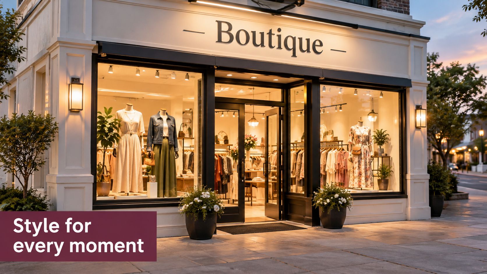
Lighting carries that clarity into the evening. Layer general illumination with focused light on the main product or display story. Avoid lighting the entire window evenly, because flat brightness can make the merchandise harder to read. During Riverwalk events, outdoor markets, and festival evenings, a warm, visible interior helps the store feel open without turning the facade into a billboard.
Choose materials with a local vocabulary
Jenks' downtown visual language can carry both history and freshness. Brick, painted wood, brushed metal, and hand-lettered accents can work together when one material leads and the others support it. The historical shift from cast-iron framing and wood-and-glass infill to steel, aluminum, neon, and larger expanses of glass shows that storefronts have always changed with available materials. The continuity comes from the relationship between interior activity and the sidewalk.
For technical background on storefront assemblies and material decisions, the Equity Building Materials storefront guide offers a useful reference. Apply that information to the actual building, local approvals, weather exposure, and the scale of the Ten District block.
Design test: Stand on the opposite side of Main Street at dusk. If the sign, door, and focal display don't read in that order, adjust the lighting or hierarchy.
Keep planters, sandwich boards, and decorative elements subordinate to the route into the shop. Materials should feel intentional, but the customer should still know where to go.
Accessibility as a Storefront Conversion Strategy
Accessibility isn't an afterthought added after curb appeal. It determines whether a customer can complete the most basic conversion step, entering the store.
Start outside and follow the entire route from the sidewalk or parking area. Check the approach, the threshold, the door hardware, the space required to maneuver, and the path through the first display zone. Then test the route with mobility devices, strollers, and children. A route that looks clear to an owner standing still may feel cramped or unusable to someone turning a wheelchair or guiding a stroller.
Federal small-business guidance prioritizes a continuous accessible route from sidewalks, parking access aisles, and public transportation to the entrance, followed by usable aisles, displays, checkout areas, and restrooms. The ADA small-business guidance provides the broader framework. Local storefront guidance identifies a typical 32-inch clear door opening, a maximum 1/2-inch threshold, and a maximum 2% slope at and leading to entry doors.
Use a sidewalk-to-checkout test
Where feasible, specify a 36-inch door leaf so the finished opening can reliably achieve the clear width. Use lever hardware, protect maneuvering space, and add directional signage if the primary entrance isn't accessible.
Checkpoint | Target | Common Failure on Main Street |
|---|---|---|
Door opening | 32-inch clear opening | A wide-looking door that measures narrower at 90 degrees |
Threshold | No more than 1/2 inch | A raised transition that catches wheels and strollers |
Entry slope | No more than 2% at and leading to the door | A sloped approach that feels manageable until a visitor tries to turn |
Route | Firm, stable, and unobstructed | Merchandise, signs, or festival equipment narrowing the path |
Hardware | Lever-style operation | A round knob that is difficult to grip |
Maneuvering space | Clear area at the door | An outward-swinging door blocked by a display or not recessed |
Inspect after every setup
Temporary conditions cause many failures. Outdoor markets, sidewalk sales, and festivals can place signs, cords, tables, or equipment directly across the route. Reinspect after every seasonal installation and event setup, not just after construction.
For a local checklist that connects compliance with the customer experience, review ADA accessibility compliance in Jenks. The strongest storefronts let wheelchair users, parents with strollers, and older visitors enter, browse, and check out without asking for help.
Connecting the Storefront to Google, Hours, and the Drive from Brooklyn
A photogenic facade can still lose a visitor from Bixby, Sapulpa, Broken Arrow, or Tulsa if it doesn't answer basic planning questions. People deciding whether to make a downtown Jenks trip want to know if the store is open, what it sells, whether children can come in comfortably, and whether the visit will be worth fitting into the rest of the day.
Recent shopping data from Northwestern's Medill Spiegel Research Center found that 24.8% of consumers planned to shop at local or small businesses, while 35.9% planned to shop online. The 2025 consumer shopping survey makes the practical point clear: the physical shop and its digital preview need to work together.
Put the minimum information on both sides
Your window and online listings should align on:
Current hours: Include holiday and event changes.
Category cue: State what the visitor can shop for.
Price-range signal: Give people a useful sense of the merchandise level without filling the glass with prices.
Accessibility note: Say whether the route and entrance are usable.
Family suitability: Make the environment easier to judge for parents.
Live updates: Use a QR code that leads to a maintained page, not an outdated campaign.
Google Business Profile updates, short product videos, and accurate hours reduce the chance that a regional visitor makes a wasted drive. A QR code works when it adds information the window can't hold. It becomes clutter when it repeats the store name, covers the merchandise, or leads to a page nobody updates.
A product catalog also benefits from structured data. Owners who want a technical starting point can review this guide to Shopify product schema setup, then confirm that product details, availability, and business information match what customers see in person.
The local SEO guidance for Jenks restaurants applies to boutiques in one important way: local search information must stay useful and current. Treat the boutique store front as decision infrastructure, not just decoration. Someone driving from Brooklyn or another Tulsa-area community should arrive knowing why the stop belongs on the itinerary.
Seasonal Refreshes, Permits, and Parking on the Ground
A storefront should change with the district, but every change needs a ground-level check. Summer aquarium traffic, fall riverfront activity, holiday windows, and spring outdoor markets bring different visitor needs. Your display can shift from light seasonal color to gift guidance or event information, but the route to the door must stay just as clear.
Use a simple seasonal rhythm:
Walk the approach: Check what visitors see from the dominant direction on Main Street.
Replace the focal story: Choose one product, collection, or local connection.
Confirm the entrance: Make sure props, planters, signs, and cords don't narrow access.
Update the digital twin: Change hours, event notes, products, and the QR destination together.
Check approvals: Confirm whether the sign, awning, facade treatment, or temporary installation needs review.
Coordinate the block: Talk with nearby owners so the refresh supports the street rather than creating visual competition.
Cedar & Lily, Motley Market, and Lenny Lane show how neighboring independent stores can turn a single storefront visit into a multi-stop outing. A block feels more intentional when owners share basic timing and wayfinding information, especially during festivals and outdoor markets.
Plan around parking that may change
The City of Jenks identifies free street parking downtown and additional parking at Jenks Commons Park, 220 E. “A” Street. That supports a park-once-and-walk pattern, where visitors leave the car near the Commons and browse Main Street shops, restaurants, and other destinations on foot. The Jenks Downtown District information is the right place to check current public parking information.
Local reporting has described discussion about removing diagonal parking, adding landscaping, and considering parallel parking or no on-street spaces as part of a more pedestrian-friendly Main Street project. Don't build your storefront message around a parking assumption that may change. Keep digital directions current, make the walking route obvious, and use signage that helps visitors understand the district rather than pointing them toward a single door.
The Ten District gives Jenks owners and visitors a local setting where storefront design, independent shopping, public art, dining, and walking routes work together. Visit The Ten District to explore Main Street, see how neighboring boutiques shape the block, and plan a downtown stop that starts at the storefront and continues through the district.


Comments